Fablab Summer Project
- Client: Stena Recycling
- My role: Co-project leader / Graphic designer
- Designteam size: 3 People
- Timeframe: 6 Weeks
Brief
In collaboration with Stena Recycling, a new physical or digital product is supposed to be created. The concept is aimed to make people more climate-smart.
Summery
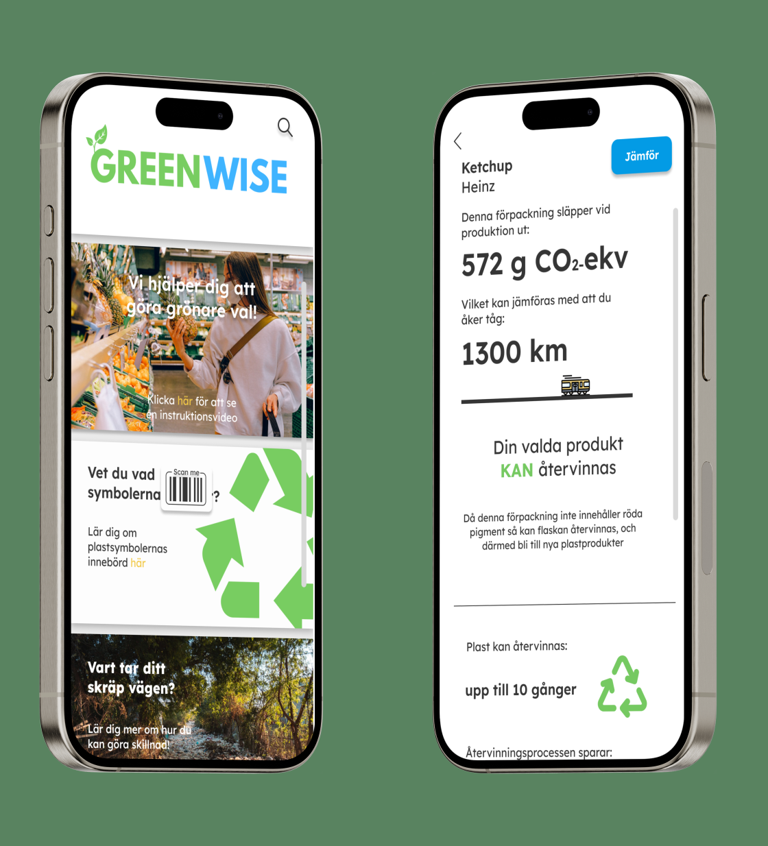
The goal of the project was to create either a digital or a analouge solution that was suppposed to make people more aware of the enviroment and how our actions affects the enviroment. In the designteam we wanted to create something that supports climate-smartness. The project resulted in a concept for a mobile application. The application allows users to scan products in a grocery store and then compare their climate impact with similar products.
Key takeaways
My biggest takeaway from this project is how to visualize data in a clear and effective way. During the process, the design team had a few different alternatives on how best to visualize the data from the different types of materials. In the end, we opted for both presenting the data in numbers, but also comparing it to something almost everyone can relate to, in this case, a train trip
Trend analysis
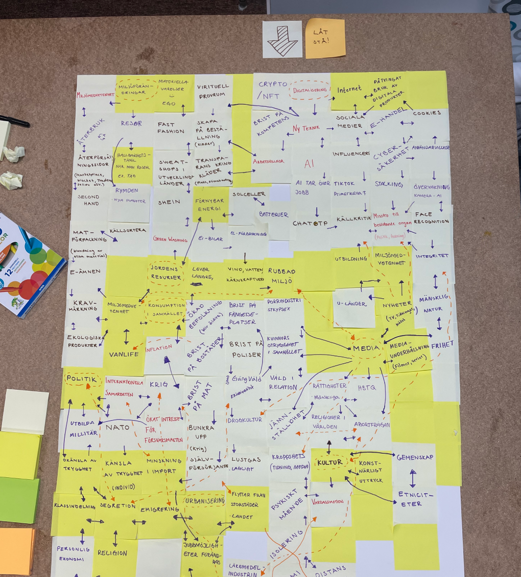
The step in this project was a trend analysis. The aim of the analysis was to identify different trend in society, and how these effect our way to think about the enviroment. For example, poor economics can effect if we choose to do a more climatesmart action or not. The identified trend then were categorized into three different groups, depending on their impact. These was:
- Mega trends - Have an high global impact and affect almost everyone, for example wars, global organizations etc.
- Macro trends - Have a national impact, and could be different for each country, but with some global impact. For example laws and politics etc.
- Micro trends - Have a big community impact, but a low global impact, for example planning of the city etc.
In this stage of the trend analysis, the design team used post it notes to write down as many trends as we could think of, regardless of it's connection to the enviroment. Since macro trends is created from mega trends, and micro trends is created from macro trends, a mega trend could appear not relevant from an enviromental standpoint. But in reality, this could be the opposite. For example, social media could sound irrelevant from a enviromental point of view. But on social media influencers is getting paid by companies to promte their products. In the long run, this will increase our consumptions, leading to an increased strain on our enviroment.
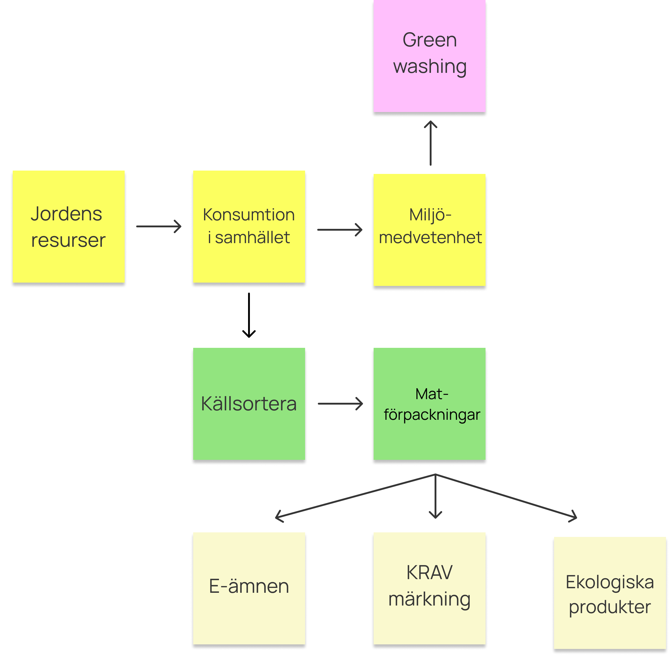
From the trend analysis, the designteam started to group mega, macro and micro trends that had some form of connection to each other. The trends that didn't fit into any group, and alone wasn't directlly connected to the enviroment was discarded. One trend that the designteam found to be interesting was "Green washing". The term Green washing is often found in different scientific studies, but rarely in more common places like news magazines. The term Green washing is describing the phenomenon of tricking private person into doing something, because they think is the more environmentally friendly option. In this case, we decided to try to battle green washing when it comes to groceries, and more specificlly groceries packages.
Desktop Research
The projected really kicked off when we started to do some desktop research about greenwashing in the food industry. We quickly found that it is very hard to find information about products enviromental impact. Their was next to none information on how different products and its packages are made. In a majority of cases, we couldn't even find out if the product was packaged at the same place that is was being produced, or if it was sent across the world to do so. It appered to be some form of silence culture with no transparancy in the food industry, and yet we still belive when they say that their product is ecological. This made the designteam very intrested in the problem, and we started to get some ideas on how this information could get more accessible by the public.
However, we did find some limited data by Livsmedelsverket, who had made calculated the avrage CO2 emission from some of swedens most usual groceries and it's packages. This data was later on used in the prototype as examples.
Survey & personas
To get a better view of who would our concept would be aimed at, the designteam conducted an online survey. Since everyone is affected by the enviroment, and everyone also need to shop groceries, we decided to spread the survey to our friends and family through social media. The only reqirement for the survey was that the respondant were 18 years old or above.
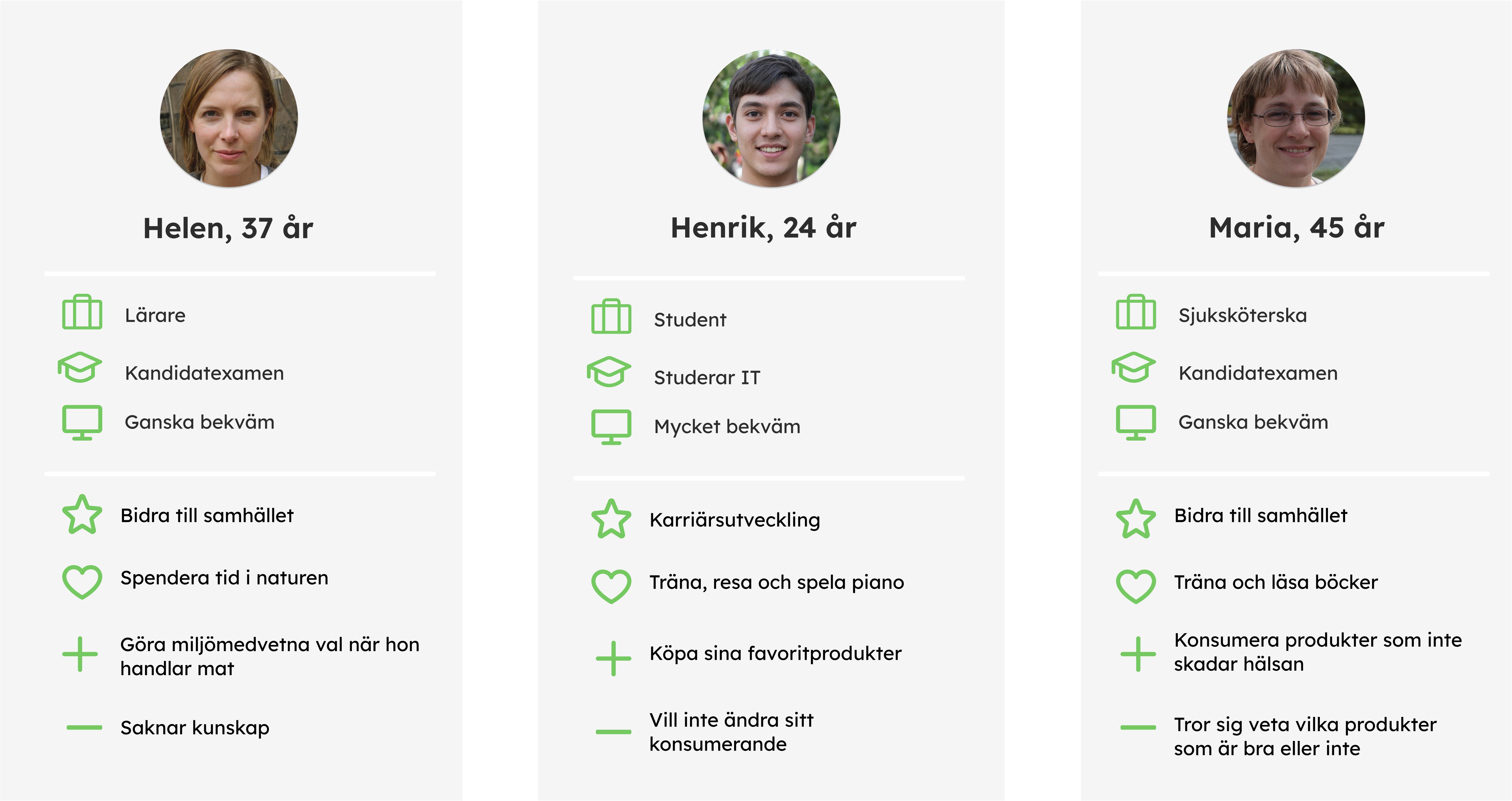
Our first assumption was that the level of education would change who people think about the enviroment, where the assumption was that a higher level of education would lead to a more climate smart thinking. However, the survey neglected our assumption, and we didn't find a connection between these. Instead, the survey indicated that different stages of our lives leads to different enviromental thinking. We found that people that have already finished their studies, and now have an active carrer, is more open to change their behaviour to make a more climate smart choice. However, everything is not black or white, and we found contrast within this group of people too. We found one group that want to make the correct choices, and wants to learn more about the enviroment to achive this. The second group also wanted to make good choices, but thought that they already knew enough, and therefore doesn't have to learn more about it.
As a contrast to both of these groups we found a younger group, that currently doesn't have a active carrer, or is in the beginning of their carrer. We found that this group is less likely to make climate smart choices, and that they are more focused on living in the moment. This group was typiclly younger (mid 20's), which could be a factor to their priorization.
Low-fi prototype
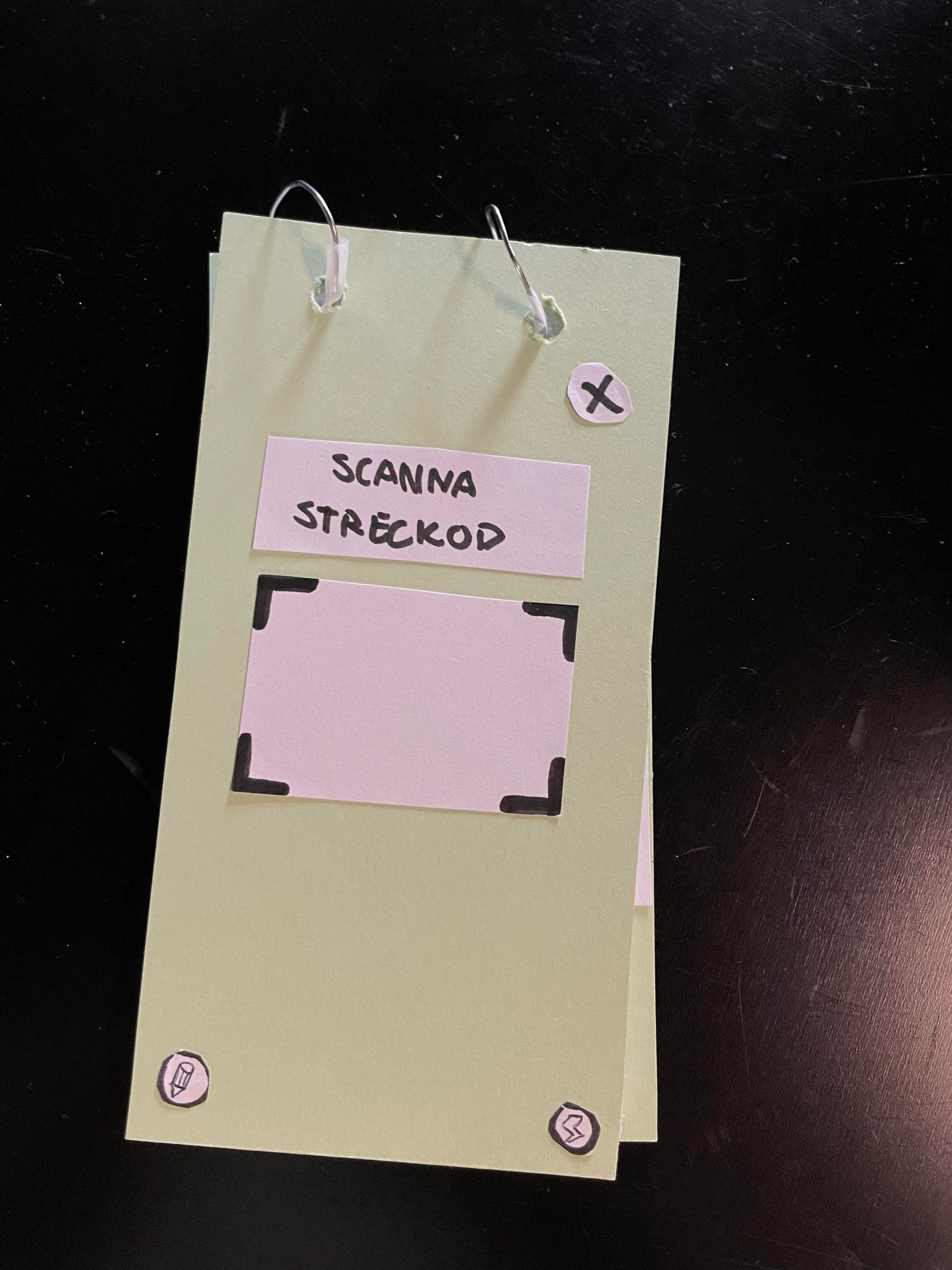
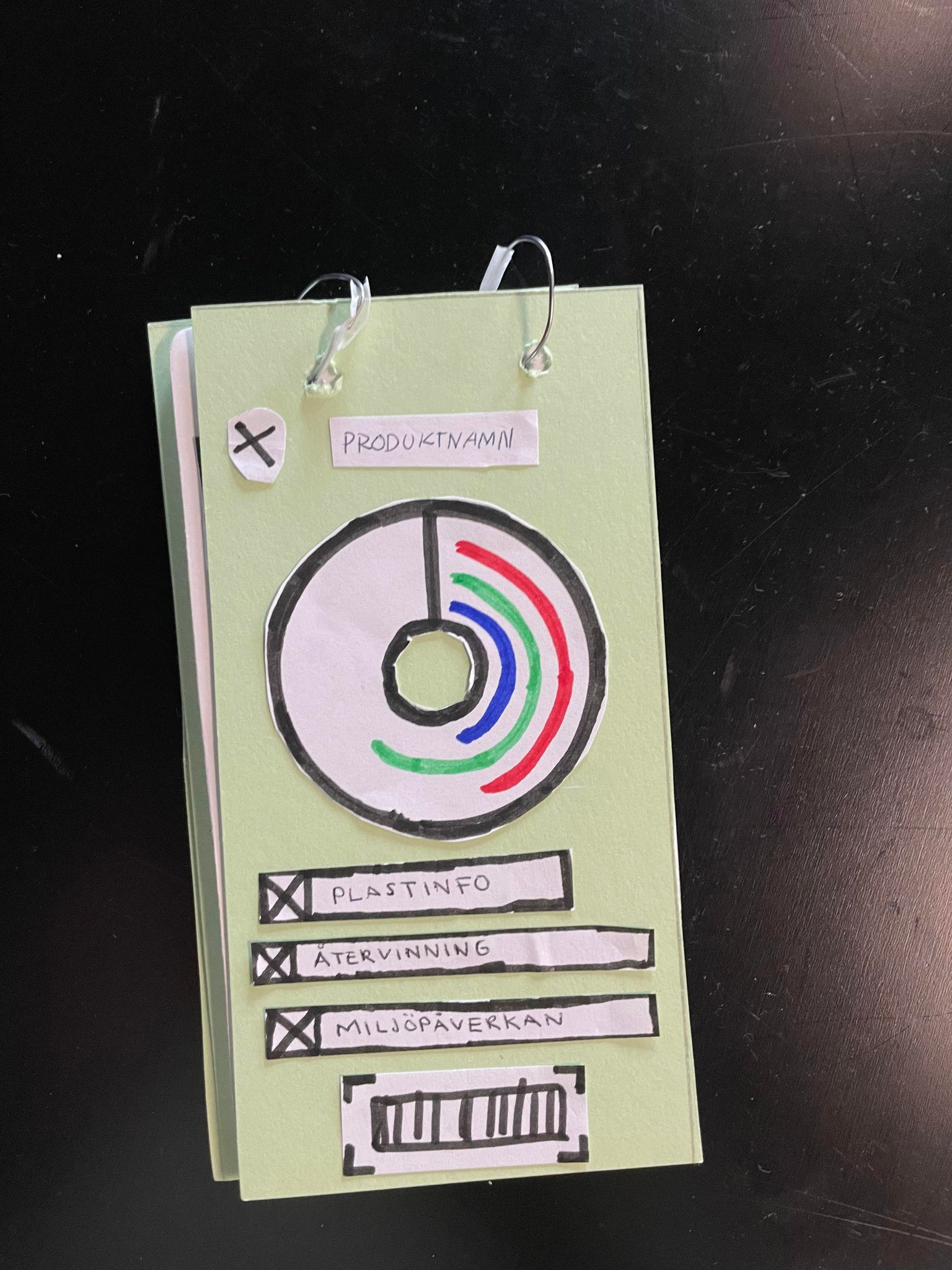
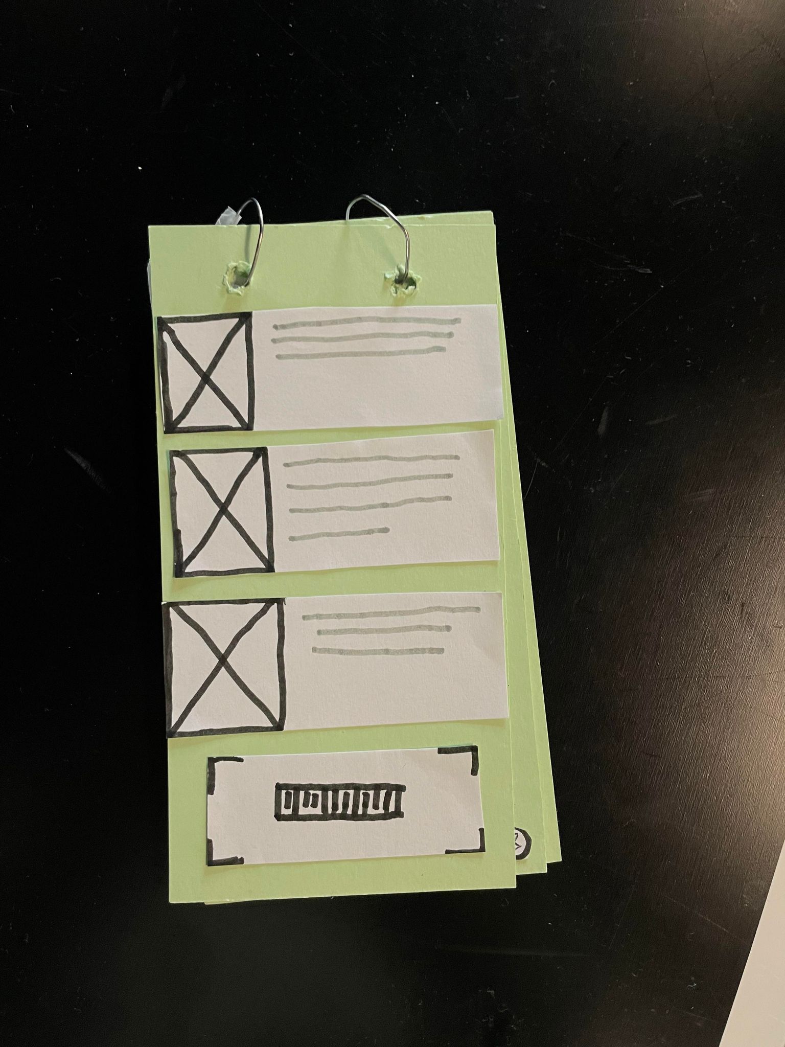
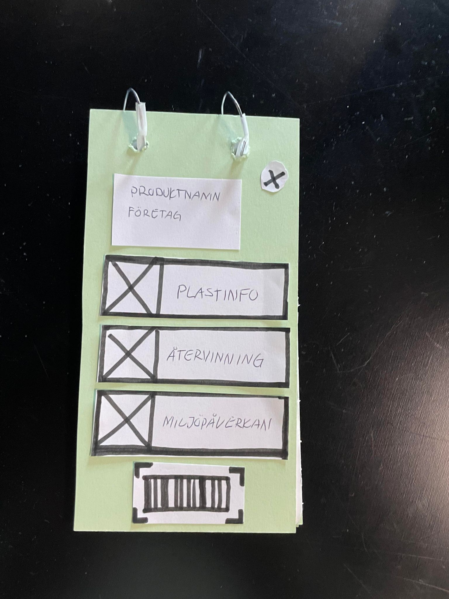
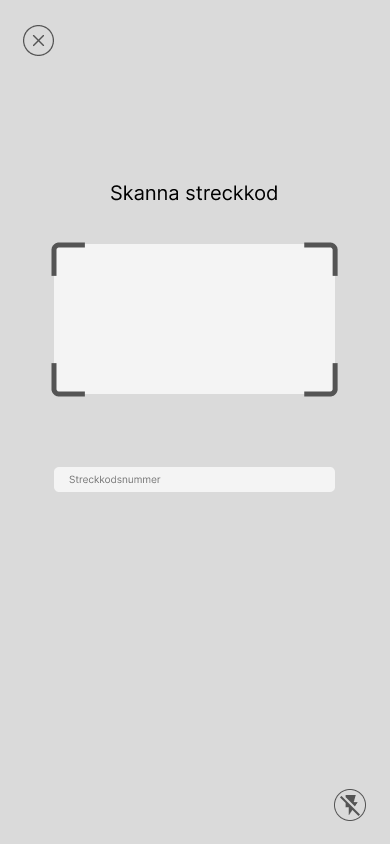
With our research done, were the design team identified a primary persona, and with some thoughts about what our application could be, we started with some paper prototypes. The aim of the paper prototype was to get a quick overview of which features that would be necessary, but also test the different flows. We did this by creating a flipbook. With a flipbook we would could visualize our idea to others, and get feedback already in this stage of the process.
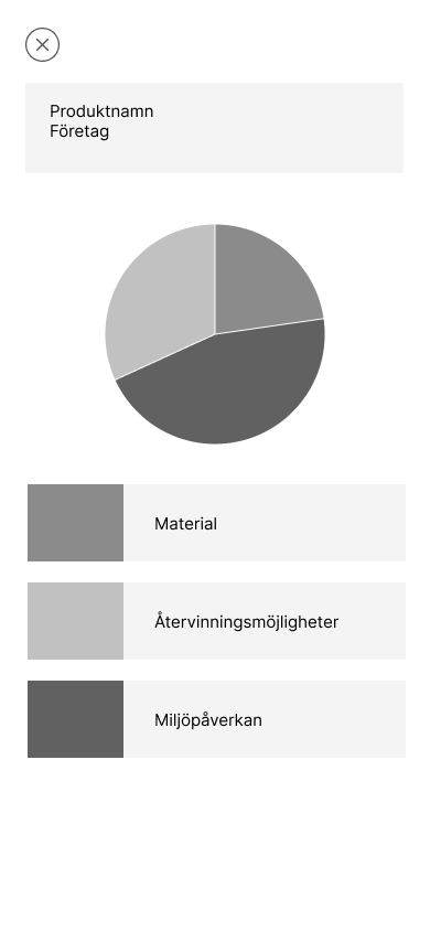
Already at this point we got some good feedback, which most of it being about our visialization of data. From our mentor, we got the feedback to start thinking about the balance of data displayed. We don't want to present data that the average person doesn't understand. However, this data could be important, and in this case we need to figure out a way to make the data more understandable.
With the feedback in mind, we also created the prototype in digital form using Figma. However, we were yet to figure out how to visualize the data and therefore the old visualization was still the same.
Mixed- to high-fi prototype
With the feedback from our low-fi prototype, we started to create a mixed fidelity prototype. The goal with to prototype was to test out the flow, if there was any missing features and to get some ideas and feedback on our data visualization.
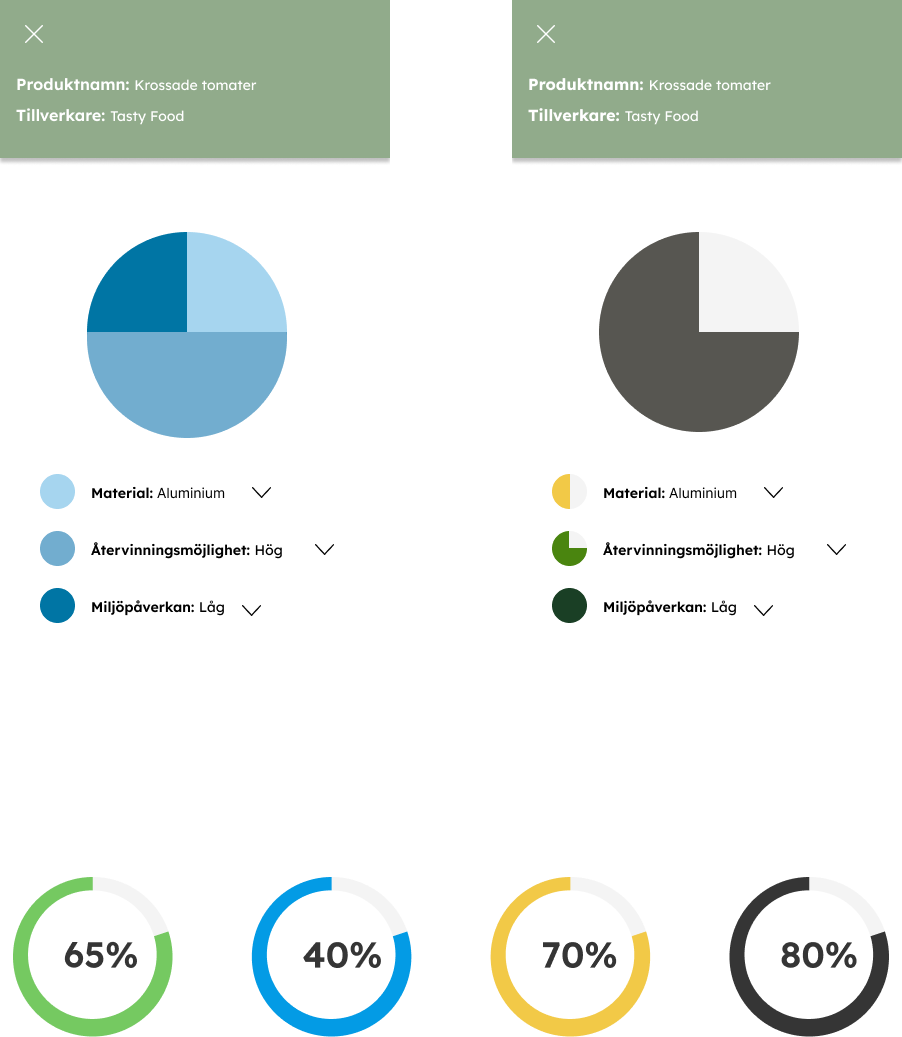
During this stage, we tried different methods of visualizing the data. Our initial idea was to give a product a score in different categorize, and then combine them and get an average score. We quickly found two major problems with this method. The first was regarding procents. No one really know what "65% material" means, and will be forced to read the explanation to understand the data. This is not what we wanted, since we wanted someone to make a quick decision, which this metod conteracted.
The second issue that were identified is that some categories could be more important than the other. For example, a product might have a high score in recyclability, but uses substances that harm the enviroment. However, when the score is averaged out, it may seem that the product isn't that dangerous, since the recyclability score make the average score alot better.
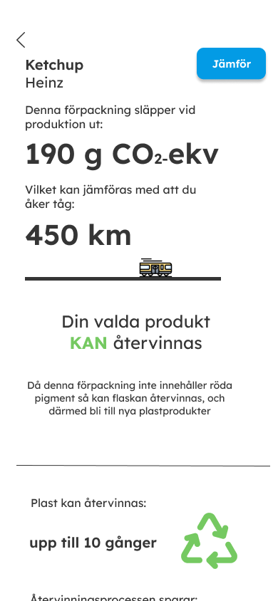
With these two issues, we decided to scrap our initial idea, and try something completly different. This is when the designteam came up with the idea to compare the data to something more relatable. I have previously seen examples of water waste being compared to filling bathtubes, and we wanted to create a similar comparison. The first thing we tried to compare it to was driving a car. However, when we compared and converted the data into km driven with a car, the amount of kilometers you could drive compared to buying the product seemd very low.
To create a bit more shockfactor, we decided to compare it to a train instead. Since the train is a more climatesmart options, this would result in getting a higher kilometer number, resulting in a bit more shocking result. The train comparison was in the end the data visualization that we decided to stick with since we both achived to shock factor and making the data relatable
